By Tyler Durden
With all eyes glued to Friday’s payrolls report, we thought it worth reiterating some ‘facts’ about US employment data. As ECRI notes, the sustained decline in the official jobless rate – now approaching the Fed’s estimate of “full employment” – is a misleading indicator of labor market slack. The data shows that the so-called jobs recovery has been spearheaded by cheap labor, with job gains going disproportionately to the least educated — and lowest-paid — workers.
Indeed, the stagnation in nominal wage growth is consistent with the weakness in the employment/population (E/P) ratio. That said, even the E/P ratio may be overstating the health of the jobs market.
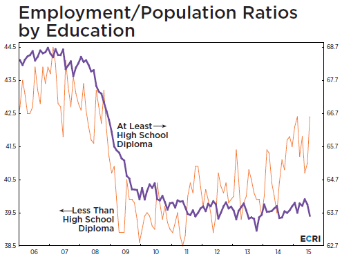
After dropping to three-decade lows in the wake of the Great Recession, the E/P ratio, has barely improved since the fall of 2013, reversing only about one-fifth of its decline from its pre-recession highs. Furthermore – as a breakdown of the E/P ratio by education level shows –this modest improvement is illusory.

Since 2011, when the E/P ratio for those with less than a high school diploma bottomed, that metric has regained almost two-thirds of its recessionary losses (orange line in chart). But the E/P ratio for high school or college graduates – i.e., eight out of nine American adults – has not recovered any of its recessionary losses, and stands about where it started, one, two and three years ago (purple line).
This data shows that the so-called jobs recovery has been spearheaded by cheap labor, with job gains going disproportionately to the least educated — and lowest-paid — workers.
This is scarcely a good basis for resilient consumer spending driven by “solid” job growth that the consensus – including the Fed – is banking on.
http://www.zerohedge.com/news/2015-09-02/exposing-lie-behind-strong-jobs-recovery-one-chart


